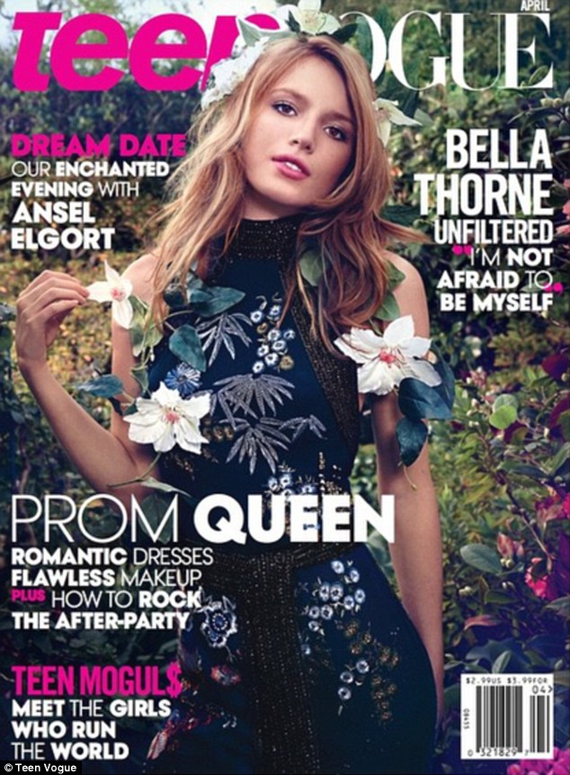
 http://www.teenvogue.com/gallery/bella-thorne | The model, Bella Thorne is positioned in the middle of the magazine. I am surprised that for this cover, there is very small amount of space left between the top of her head and the edge of the cover. Layering the texts in front and behind the model gives the composition the illusion of depth and makes it more interesting. However, I feel that the model’s head shouldn’t cover the ‘V’ in the magazine’s name “Vogue” because the masthead is one of the essential part of a magazine. The Teen Vogue magazine seems to use hot pink and white as the colors for the texts on the cover page; while most of the time, Vogue’s masthead is in white color. Bella Thorne’s dress is full of floral patterns, consequently I think the background should be more blurred out. To me this background gives a chaotic energy and makes it difficult for me to focus on the model. I notice that this cover page uses at least five different typefaces, which is probably too much. For my cover page design, I would try to limit the type face to two or three. The texts are well-spread (proximity) across the page. I really like how the word “queen” is bold and is somewhat near the middle of the page. The model slightly tilts her head and has one arm lifted up, touching parts of her floral prom dress. The color scheme and her facial expression gives a subtle and calm mood. In addition, Bella’s dress’ dark color contrasts with the lighter background and her skin tone. Therefore, her face really stands out from the rest of the composition. |
 https://www.pinterest.com/explore/november-2015/ | The first word that came up to my mind was ‘elegance.’ I love the expression of the model’s face. The placement of her hand and arm leads the reader’s eyes toward her head and face, which is the focal point of the cover. Her face is located at the one-third line, following the proportion rule. The contrasting colors, blue and pink, highlights the model. Although I can’t understand what the text means because it is in another language, I like the typeface that the designer used because it goes well with the theme of elegance. I also like how the masthead is not behind the model. Her cloth creates a diagonal line which is parallel to her arm. The colors used are also not too vibrant and the background is kept plain in order for the masthead to be prominent. This cover is actually one of my favorite because the cover lines are not compacted together like the previous. It feels like the texts placement on this design is more balanced. |
 http://beautystat.com/site/makeup/makeup-trends-2016-2017-lupita-nyongos-october-2015-vogue-magazine-cover-wearing-lancome/ | What I like best of this cover design is the use of different font sizes. The designer used only three typefaces; this allow the magazine cover to appear to be very neat and well organized. The cover lines on both left and right side also create a sense of balance. The background color is suitable for the model because if the background was to be white, it would make the model seems to have extremely dark skin and that wouldn’t appeal to the audience. If the designer uses black, he or she would loose the details to the model’s hair and that would create chiaroscuro effect, which is probably too dramatic or extreme. Similar to the cover with Bella Thorne, the model is placed in the middle of the page, dividing it in half and creating a relatively symmetrical aspect to the cover. Her dress fabric is reflective, therefore the highlights on the dress, her shoulder and face, along with the white color text unite the cover page together. The small red pattern on the rest also goes well with the red color masthead. According to these few samples, Vogue’s magazine cover page format must always have the masthead at the top of the page, but the barcode can either be on the left or right side at the bottom of the page. |
 http://www.vogue.com.au/vogue+magazine/cover+archive | Last but not least, I chose this cover page to analyze because unlike the other covers, the model is doing a standing pose which goes with the cover line “Are you pretty enough?” The pose with right and left arms on the hip create lines that leads to the focal point which is the model’s face. It’s intriguing because although the model is placed in the middle of the page, the cover is asymmetrical. However, I feel like the designer should give more space between the head and the top edge of the cover. The current composition feels like the model is captured inside a box or something. The light brown pattern on the model’s dress is the same tone as her tan skin; therefore, it creates a sense of harmony in the overall composition. In addition, the curved lines formed by her arm muscles, chest, hip, and hair, give off some kind of movement which makes the cover page seems to be dynamic and full of energy. Furthermore, the negative white space in the background contrasts with the model's black dress. The texture created by the leaves and bushes in the background makes the cover looks more interesting. Other than that, the color of the text on the page goes well with the rest of the composition. I think if the designer was to choose black or brown colors instead of aqua, that would make the cover page seems to be too dense or heavy. |
 http://grist.org/science/meet-the-new-national-geographic-and-weep/ | National Geographic's magazine cover is surrounded by its distinctive yellow border (logo). Using a formal typeface on the masthead, it is able to contrast with the informal typeface which is used on the coverlines. Most of the National Geographic magazine covers feature images of a variety of topic including nature, landscape, macro, people, photography in interesting angles. For this cover, the curved lines formed by the waves almost follow the golden proportion or the golden ratio. I'm surprised that the coverline in this magazine cover is actually bigger than the masthead. The target audience is obvious: those who are curious and are interested in science, humanities, and other topics National Geographic covers (life-long learners ages 14 and above). I notice that National Geographic's cover is kept very simple, formal, yet extremely attractive. |
 http://ohnotheydidnt.livejournal.com/42984692.html | Target audience: those (most likely men) who are interested in health, fitness, and muscle building. The theme color for this cover is orange and blue. The typeface used in sports magazines are completely different from fashion magazines and other types of magazines. The typeface tend to be bolder and the designer tend to use complementary colors and maximize contrast. The models that are on the cover are also shirtless and are muscular. In most cases, the barcode is on the bottom left of the magazine and like fashion magazine, the model that is featured on the cover is credited somewhere on the cover. The white color of the masthead and the main coverline, along with the reflection on Dwayne Johnson's body unite all the elements in this cover together. Perhaps if the background was black, it would create a 'too harsh/powerful' atmosphere for the reader. |
Creative Cover Design
Other magazines that I found interesting include these:
 Uses vibrant and contrasting colors face paint to attract attention. |  A medium shot of the model avoiding eye contact and having half of her face hidden; this makes the model seems to be mysterious and interesting to get to know. |  Instead of having masthead at the top like every other magazines, the masthead is located right in the middle of the page on top of the model. It is as if someone stamps the masthead onto the model, causing her to feel annoyed or pissed. |
Interesting tutorial:
http://www.digitalartsonline.co.uk/tutorials/adobe-indesign/how-design-magazine-cover-with-pantone-colours-spot-varnishes/
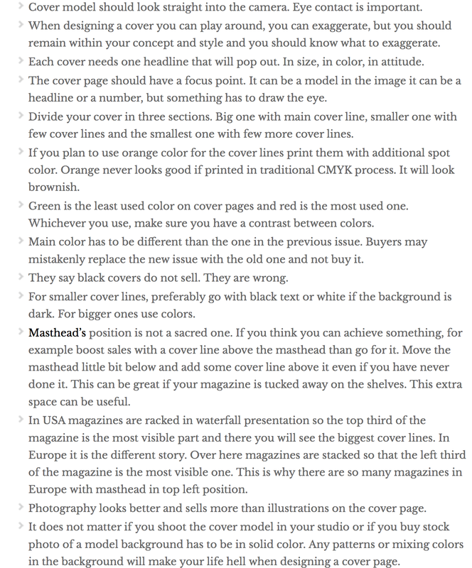
Magazine Cover Design Tips:
http://www.magazinedesigning.com/55-best-tips-for-a-sucessful-magazine-cover/
http://www.digitalartsonline.co.uk/tutorials/adobe-indesign/how-design-magazine-cover-with-pantone-colours-spot-varnishes/
Magazine Cover Design Tips:
http://www.magazinedesigning.com/55-best-tips-for-a-sucessful-magazine-cover/
 RSS Feed
